Download PDF
Download page Managing Data Grid View.
Managing Data Grid View
You can create a customized Data Grid View (List View) page according to your business needs and preferences. You can control which columns in the Grid View are displayed. This allows you to focus on the most relevant data and hide unnecessary columns, providing a more streamlined and personalized view of the information. Additionally, you can add action items (buttons) as a provision to accomplish specific actions from within the screen. This section describes managing a data grid view page layout.
To manage a grid view layout
- Log in to the Conga Platform as an admin user.
- Click the App Launcher (
 ) icon from the top-left corner then go to Apps > CX Studio.
 - Open the page or object layout properties in which you want to add or update the grid view properties. You can open the page properties window in the following ways:
- While Creating a New Page: Pages > New Page > select a template > Next > fill in details > Next.
- While updating an Existing Page: Pages > click page name link.
- While updating an Object Layout: Object Layouts > click the More (
 ) icon > Edit.
 - Editing a Page from RLP or a Supported Application (e.g., CLM): Open the page > click Edit Page button from the top right corner.
The page has two main parts: the PageHeader pane for adding actions, and the Label pane for adding or updating content layout.
To adjust the grid area components and their properties, click on the bottom panel of the page. The Properties window appears.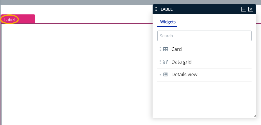
- Select Data Grid option from the properties window and drag it into the label pane; it will show records for the entity chosen during page creation.
- The Properties window lets you control the grid area components and their characteristics. You can adjust the following grid layout properties:
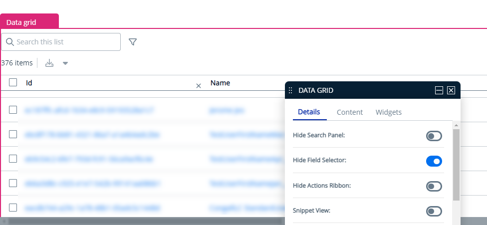
Options Description Details tab Hide Search Panel Enable this toggle to hide the search panel grid. Hide Field Selector Enable this toggle to hide the field selector
 (View Settings) from the grid.
Entity Type This field displays the name of the object linked to the layout and is automatically filled based on the object you select while creating the layout.
Bulk Actions Use this option to add or edit bulk actions for multiple records with JavaScript, such as options for previewing, sending, or deleting. Click the Open link to add or edit JavaScript.
Sample js for delete action
{ "label": "Delete", "icon": { "name": "delete" }, "actionFunc": "Grid::onBulkDelete", "actionCategory": "tertiary" }CODECustom Actions Use this option to add new or edit existing custom actions in the page header with JavaScript. Click the Open link to add or edit JavaScript.
Sample js for custom action
[{ "type": "button", "label": "YOU CAN CHANGE ME :)", "icon": { "name": "" }, "variant": ["Size.MD", "ButtonStyle.Outline", "ButtonColor.Primary"], "anchor": { "url": " https: //www.conga.com","target":"PageTargetType.Dialog"}},{"type":"button","label":"CUSTOM ACTIONS "," icon ":{" name ":" "}," variant ":[" Size.MD "," ButtonStyle.Filled "," ButtonColor.Primary "]," actionFunc ":" Grid::onSave "},{" label ":" More options "," icon ":{" name ":" fa - grid - 2 "}," actionFunc ":" Grid::onEdit "}]CODERow Actions Use this option to add or edit actions for rows with JavaScript, such as options for editing or deleting individual records. Click the Open link to add or edit JavaScript.
Sample js for row actions
[{ "label": "Edit", "actionFunc": "generic-page-template::GenericContainer::onEdit" }, { "label": "Delete", "actionFunc": "template-list::Grid::onDelete" }]CODERows Per Page Enter the number of rows you want to display per page. Content tab Manage Fields Allows you to control which columns in the data grid are displayed. Search for and drag-and-drop entities in your grid layout. Click and drag a column name to move it before or after another column in the list. - Click Publish to save.