PowerPoint has a rich array of charting capabilities and Conga Composer lets you generate charts using Salesforce data. Your Salesforce data should be aggregated on some numeric field. Because Salesforce SOQL Queries (and Conga Queries) make it easy to aggregate on numeric fields, they’re ideal for retrieving data compatible with PowerPoint charts.
To create a chart within a PowerPoint template:
Create a Conga Query (SOQL) that pulls two fields from Salesforce: a category and an aggregated numeric field.
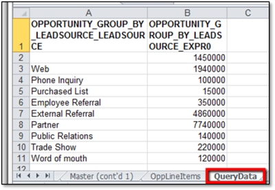
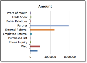
To gather data for a bar chart that depicts the total of the Amount of each Opportunity, grouped by Lead Source: SELECT LeadSource, SUM(Amount) FROM Opportunity GROUP BY LeadSource or SELECT Status, COUNT(Id) FROM Case WHERE AccountId = '{pv0}' GROUP BY Status ORDER BY Status ASC After the Conga Query is saved and included in the Conga Composer button, it appears on the Template Builder window as QueryData. In this example, the first column will be used for the column labels (category) and the numeric values will be used for the bar height (series). Use the &DisableRowNums parameter in your button or link URL to remove the row numbers from your query dataset. Otherwise, the row numbers will appear in the chart.
In your PPTX template, select the slide to contain the chart.
ClickInsert → Chart.
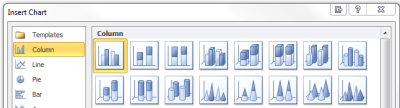
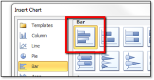
Select a chart style. PowerPoint opens an Excel workbook with Sample data.
(Optional) Format the chart.
Link the chart to your Conga Query:
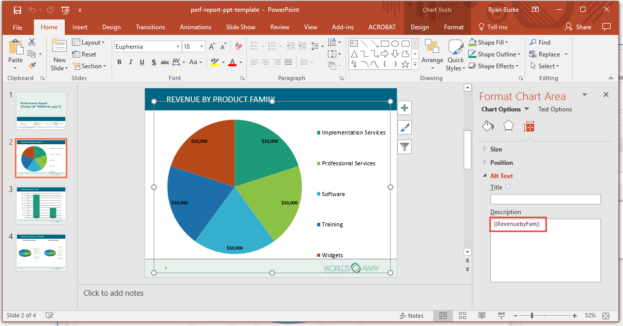
Click on the chart. TheFormat Chart Areapanel will appear. ClickChart Options,then clickSize & Properties.
Expand theAlt Textdrop-down to show theTitleandDescriptionfields.
On the Alt Text tab in the Description field, enter the DatasetName that contains the data to chart using the following convention: {{DatasetName}}. In the image above, we used {{RevenuebyFam}}. The data found on the QueryData sheet will be inserted into the Chart because we referenced {{QueryData}}. The merge process renders the chart with the data from the dataset referenced. The chart can be formatted (in the template) in a variety of ways: the axis values, chart legend, chart title, etc.