You can create a customized Data Grid View (List View) page according to your business needs and preferences.You can control which columns in the Grid View are displayed. This allows you to focus on the most relevant data and hide unnecessary columns, providing a more streamlined and personalized view of the information. Additionally, you can add action items (buttons) as a provision to accomplish specific actions from within the screen. This section describes creating a data grid view page layout.
To manage a grid view layout
Log in to the Conga Platform as an admin user.
Click the App Launcher () icon from the top-left corner then go to Apps > CX Studio.
Open the page or object layout properties in which you want to add or update the grid view properties. You can open the page properties window in the following ways:
While Creating a New Page: Pages > New Page > select a template > Next > fill in details > Next.
While updating an Existing Page: Pages > click page name link.
While updating an Object Layout: Object Layouts > click the More () icon > Edit.
Editing a Page from RLP or a Supported Application (e.g., CLM): Open the page > click Edit Page button from the top right corner.
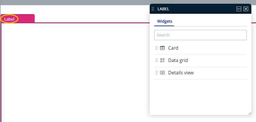
The page has two main parts: the PageHeader pane for adding actions, and the Label pane for adding or updating content layout. To adjust the grid area components and their properties, click in the bottom panel of the page. The Properties window appears.
Select Data Grid option from the properties window and drag it into the label pane; it will show records for the entity chosen during page creation.
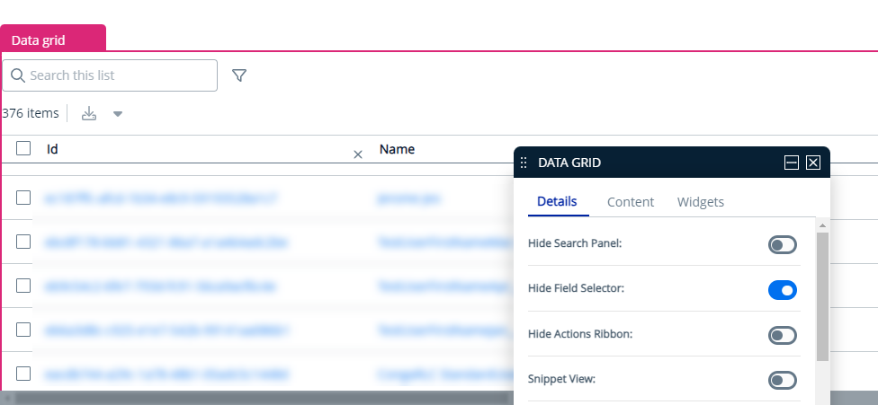
The Properties window lets you control the grid area components and their characteristics. You can adjust the following grid layout properties:
Options
Description
Details tab
Hide Search Panel
Enable this toggle to hide the search panel grid.
Hide Field Selector
Enable this toggle to hide the field selector (View Settings) from the grid.
Hide Action Ribbon
Enable this toggle if you want to restrict users to be able to save any modifications to the record. The Save and Cancel buttons on the Edit Record Details page will be disabled.
Snippet View
Enable this toggle to enable an option to view additional information associated with the selected record. Click the arrow () icon next to the record to expand it.
Pinning
Enable this toggle to pin columns on the left and right sides of a grid panel while keeping the middle columns scrollable. It gives enhanced visibility of important data while scrolling horizontally, improved navigation, easy comparison of data points across different rows, and access to constant information.
Draggable Rows
Enable this toggle to make individual records within the list draggable, allowing users to rearrange their order by dragging and dropping them. It enhances the user experience by providing a more interactive and intuitive way to reorder items in a list.
Rows Per Page
Enter the number of rows you want to display per page.
Content tab
Manage Fields
Allows you to control which columns in the data grid are displayed. Search for and drag-and-drop entities in your grid layout. Click and drag a column name to move it before or after another column in the list.