PDF
Download PDF
Download page Conga Grid Graph Types.
Conga Grid Graph Types
Bar Graphs
Important
Bar Graphs in Conga Grid allow users to select one field as a Category and one or multiple fields as the Series.
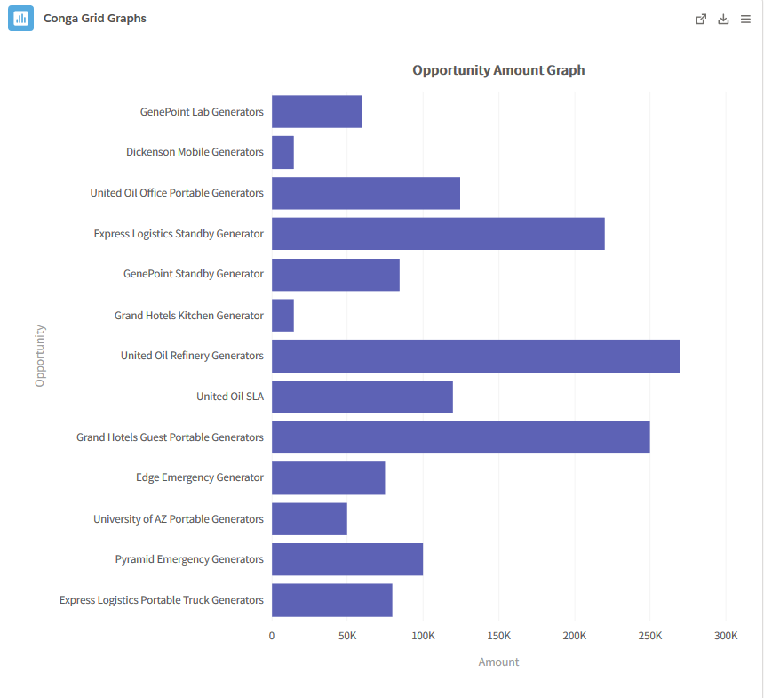
- Bar: A Bar graph displays quantitative data and is useful for comparing data points. It consists of horizontal bars with lengths proportional to the data values they represent. One axis of a bar chart graphs a Category and the other axis portrays the data values.
- Example:
- Example:
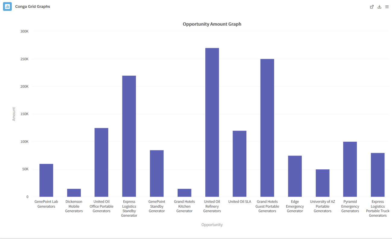
- Column: A Column graph is useful for comparing data values of related categories in a vertical fashion. The value of a Category is represented by an individual vertical column. It is also useful to compare and contrast data over time.
- Example:
- Example:
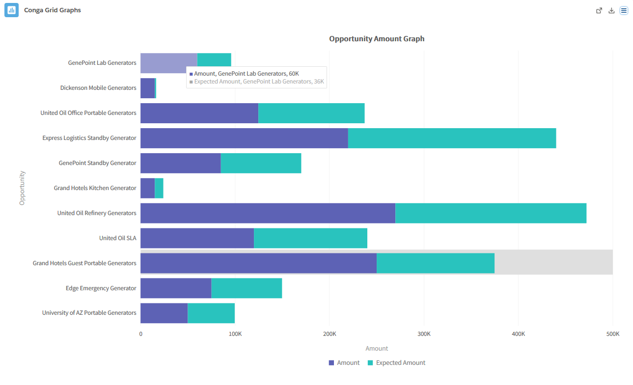
- Stacked Bar: Stacked Bar graphs are useful for portraying how much a Category contributed to its Category’s total. This type of graph is also helpful in comparing sub-groups with similar sub-groups of other categories, which standard bar chart cannot portray as clearly.
- Example:
- Example:
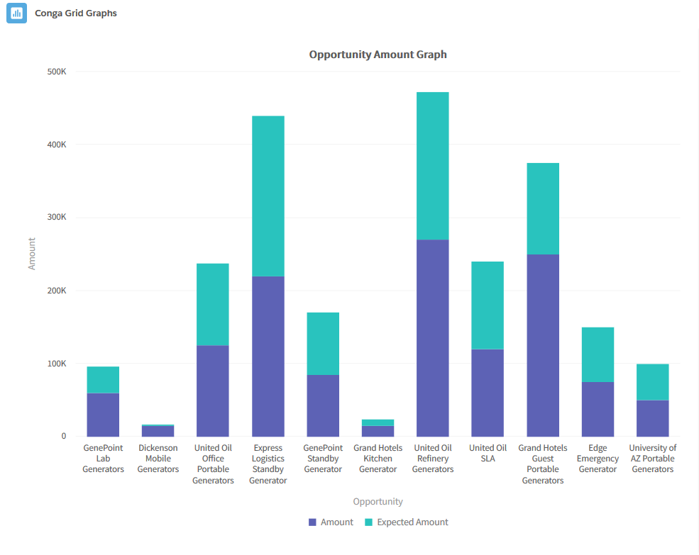
- Stacked Column: A Stacked Column graph portrays the extent of a record's specific contribution to a total data value. It is use for breaking down and comparing multiple metrics against each record.
- Example:
- Example:
Pie Graphs
Important
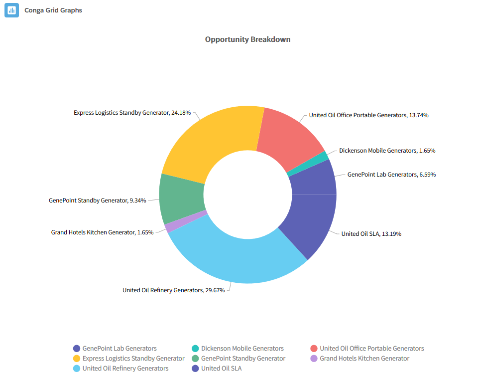
Pie Graphs in Conga Grid allow users to select one field as a Category and one field as the Series.- Donut: The Donut graph contains a blank circle in the middle and is useful for emphasizing each record's contribution to an entire total.
- Example:
- Example:
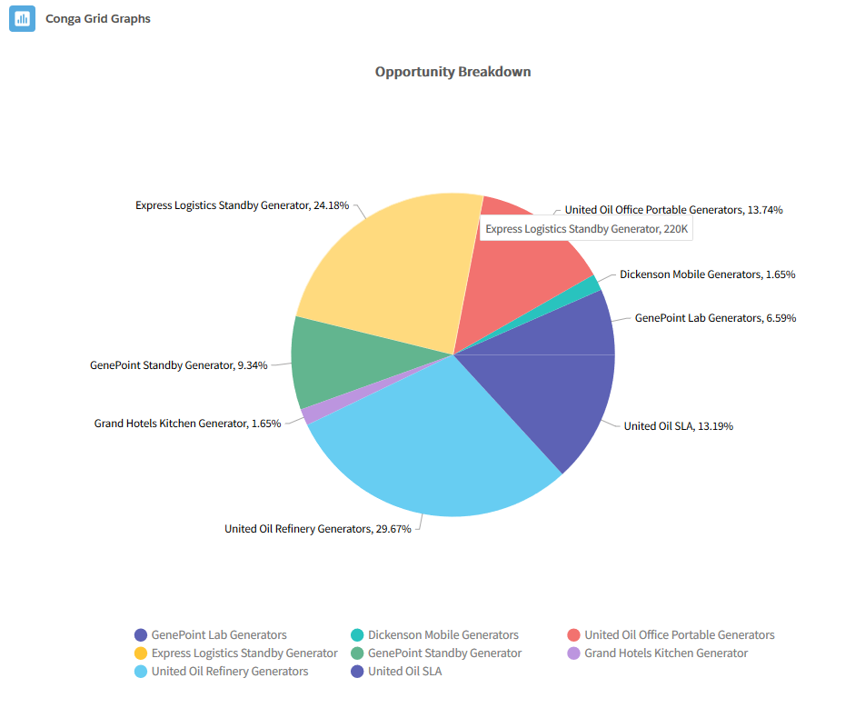
- Pie: The Pie graph is a circle divided into categories, each representing a contribution to an overall total. It is useful to display the percentage or contribution of each record.
- Example:
- Example:
Line Graphs
Important
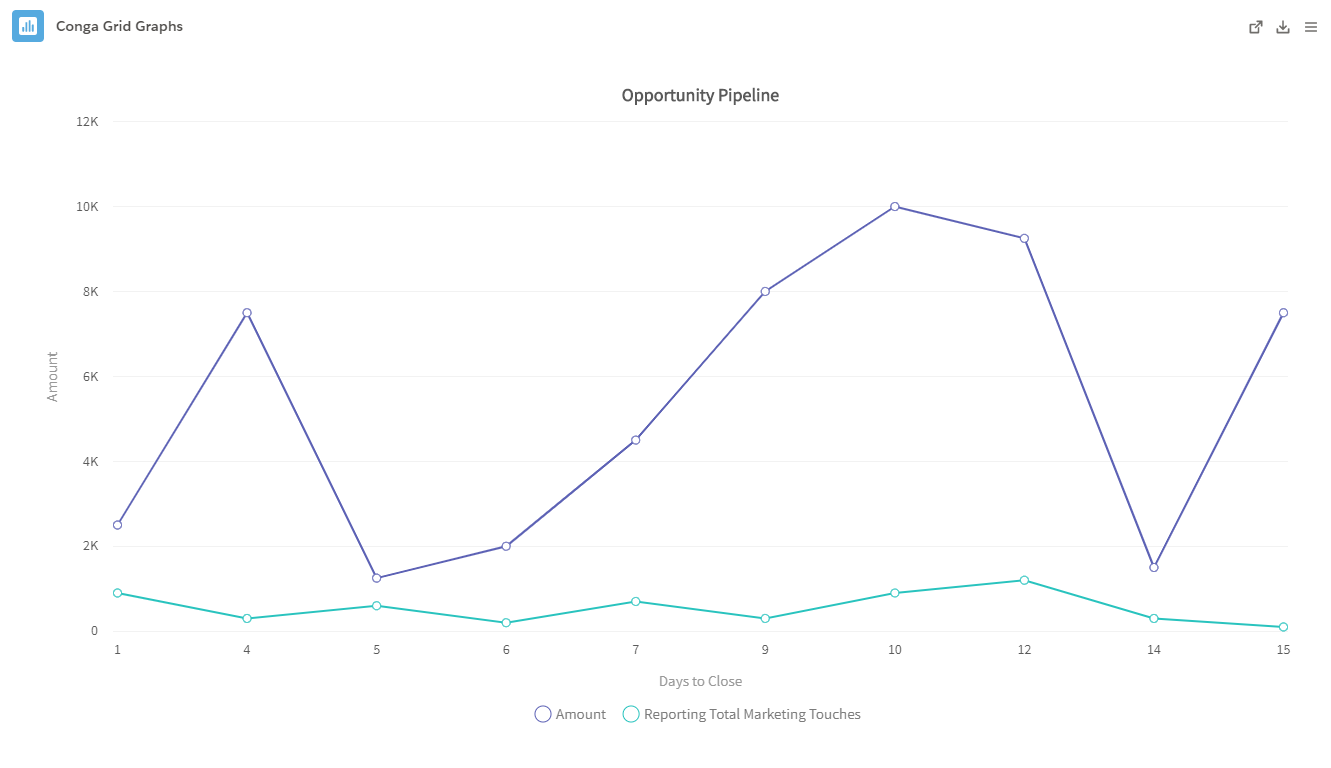
Line Graphs in Conga Grid allow users to select one field as a Category and one or multiple fields as the Series.- Line: The Line graph displays trends and relationships for multiple data points. It uses connected line segments to portray multiple data points. Line graphs are useful for displaying data trends over a time period.
- Example:
- Example:
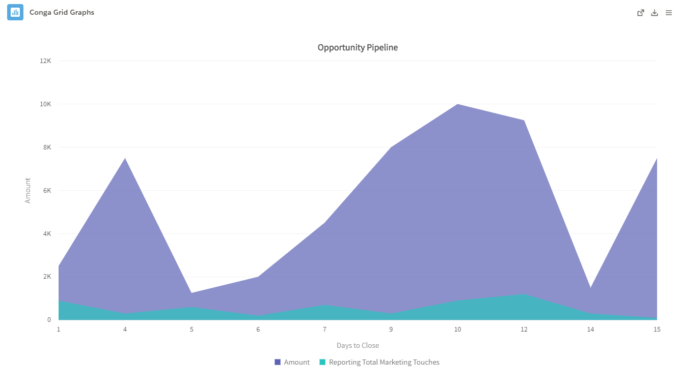
- Area: The Area graph displays data values of multiple fields connected with line segments. It is useful for portraying data trends and changes over time.
- Example:
- Example:
Other Graphs
Important
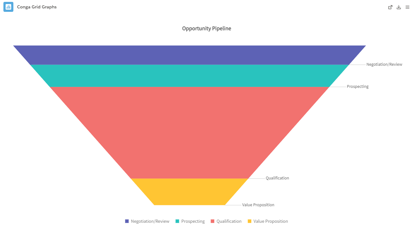
Funnels in Conga Grid allow users to select one field as a Category and one field as the Series.
- Funnel: A Funnel displays data effectively throughout an entire process. It measures and portrays data during specific phases in a funnel shape with multiple segments.
- Example:
- Example:
Important
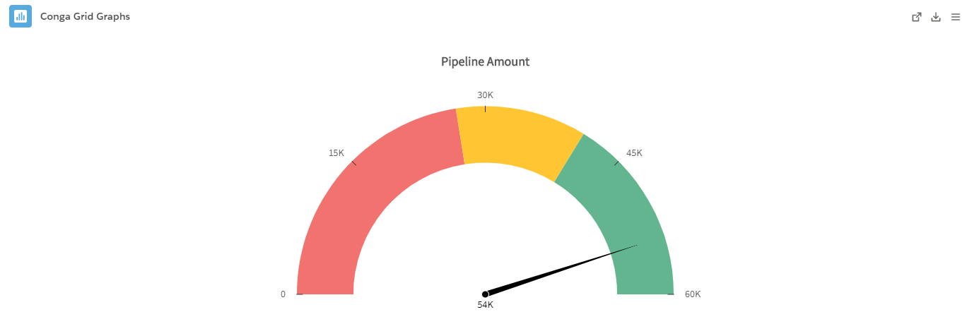
A Gauge in Conga Grid allows users to measure records by one field and identify up to three Segment Ranges by specific values.
- Gauge: A Gauge displays data in a progressive manner on a radial scale. The dial in a Gauge indicates the progress towards a designated data point. Gauges are useful for tracking "% to Goal" metrics and other metrics typically displayed on sales dashboards.
- Example:
- Example:
Important
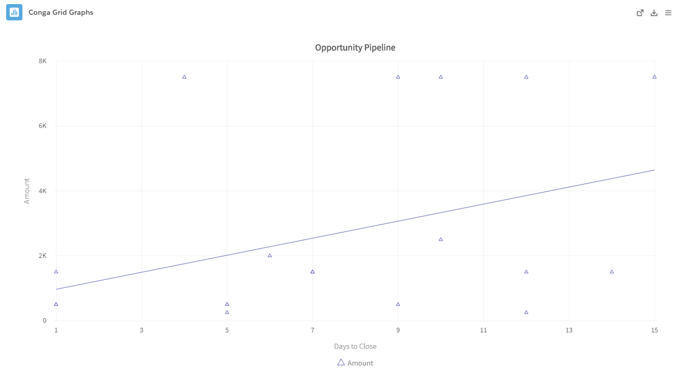
A Scatter Plot in Conga Grid allows users to measure records by one Category and a minimum of two Series.
- Scatter Plot: The Scatter Plot displays the relationship between data points by plotting coordinates on a chart. Scatter Plots are useful for comparing trends against one another and determining how certain field values influence one another.
- Example:
- Example:
For more information on the different types of graphs, see Fusion Charts documentation.